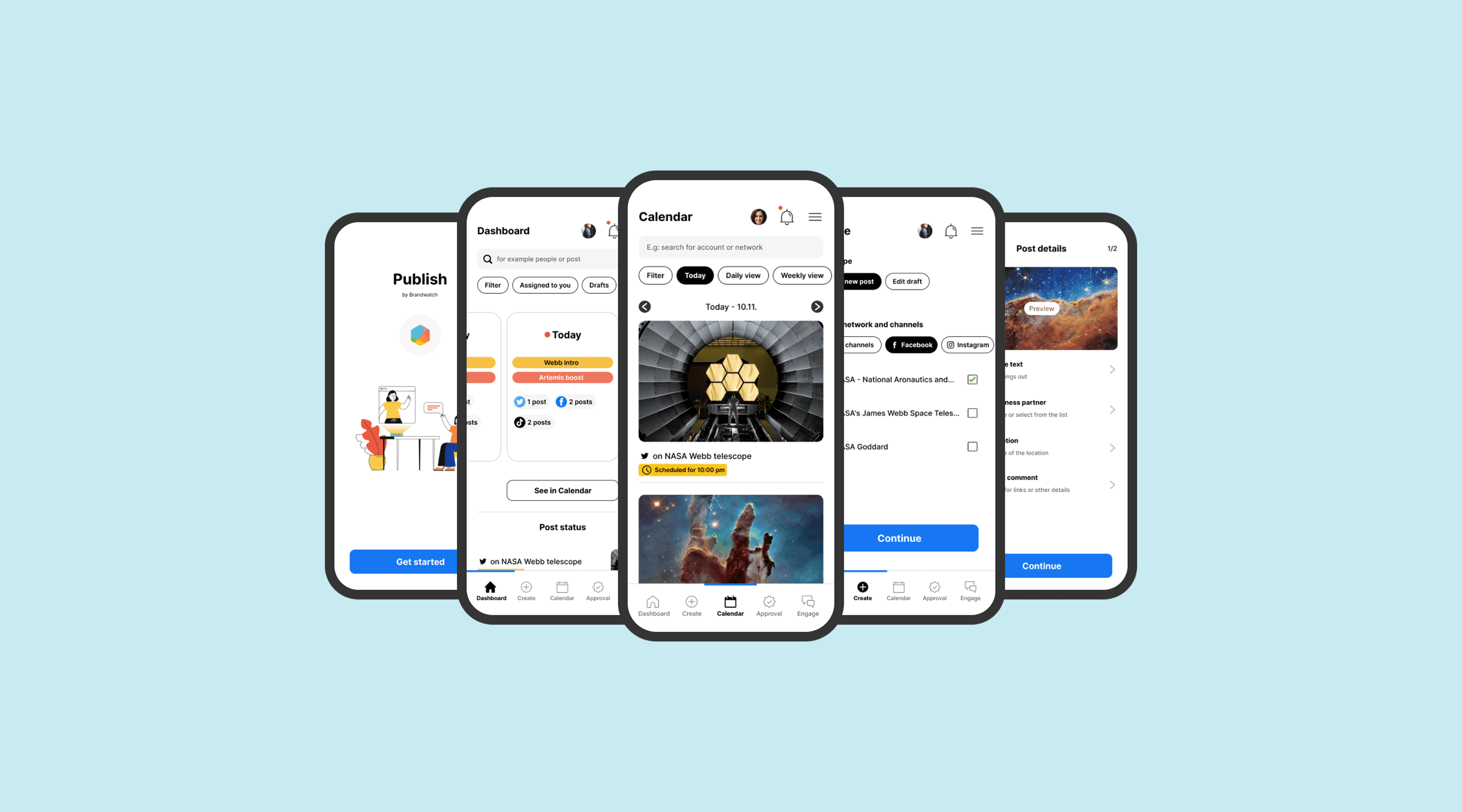
The Business Problem
Mobile was quietly bleeding money
When I joined Brandwatch (formerly Falcon.io), the mobile apps were the company's dirty secret. While the web platform powered enterprise social media management for Fortune 500s, our iOS and Android apps were generating complaints, driving churn, and getting ignored by leadership.
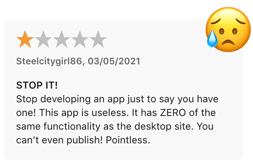
The data was damning: support tickets mentioning “mobile” had a 3x higher churn correlation than any other category. We were losing $50K+ in MRR annually to users who cited mobile limitations in exit surveys. Yet the apps hadn't seen a meaningful update in 18 months.
The challenge wasn't technical debt alone—it was organizational neglect. Mobile was seen as a “nice-to-have” in a web-first company—no team really owned the project. The apps existed in maintenance mode while competitors shipped polished, single-app experiences with 100K+ users to our thousands.
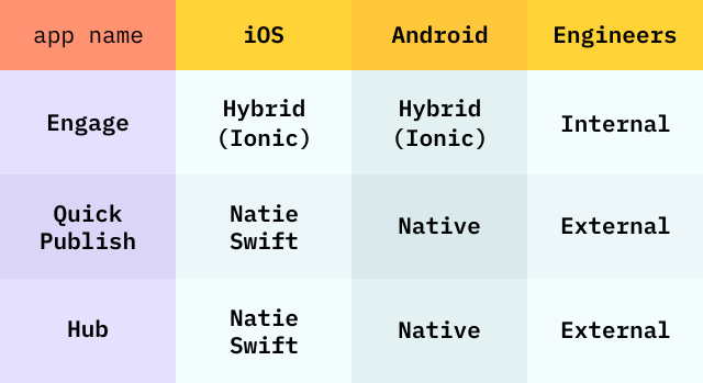
The fragmented app-portfolio
My Role
Building the case for a path forward
I was brought in to answer a strategic question: what should Brandwatch do about mobile?
My job wasn't to redesign screens—it was to build the case for a path forward and define what that path should look like. I led the discovery effort, designed the research program, synthesized findings for leadership, and created the product vision for a consolidated app.
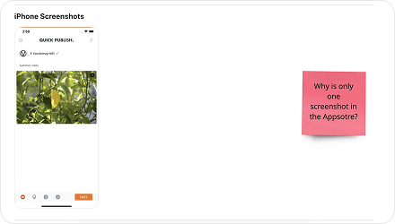
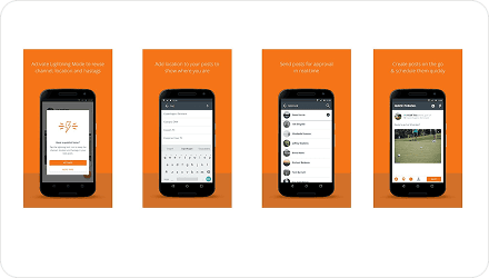
iOS Appstore and Google Playstore appearance of the same app
The Insight
Fragmentation & reliability issues
The conventional wisdom was that we needed to “fix” each app incrementally. My research killed that assumption.
Through 9 customer interviews, stakeholder sessions across 4 departments, competitor analysis of 9 products, and a design audit, I surfaced a pattern: users didn't want three better apps—they wanted one app that matched their unified desktop workflow.
Internally, teams were afraid to promote the apps. Customer-facing staff described feeling “embarrassed” to suggest mobile solutions.
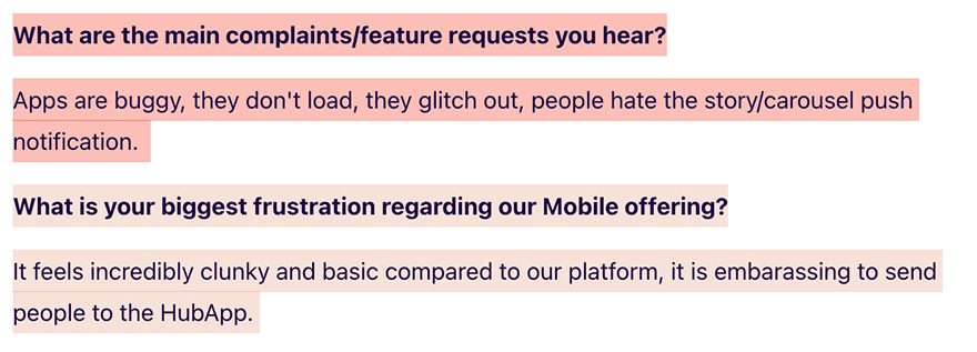
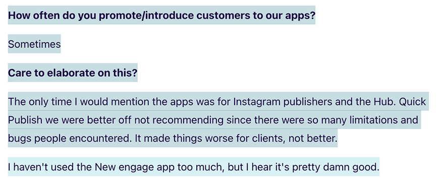
The Research
Three personas, three use cases

The Manager
Needs quick approval workflows on-the-go. Checking post queues during commute, approving content between meetings. Values speed over depth.
Key Need
“Approve posts in under 10 seconds”

The Creator
Creates content from events, conferences, or field. Needs mobile-first publishing with photo editing and hashtag suggestions. Desktop is secondary.
Key Need
“Publish Instagram stories in real-time”

The Responder
Monitors brand mentions and responds to crises. Needs push notifications, sentiment analysis, and quick-reply templates. Uptime is everything.
Key Need
“Never miss a critical mention”
The through-line: all three needed to complete critical tasks without switching to desktop—exactly the moments mobile should shine.
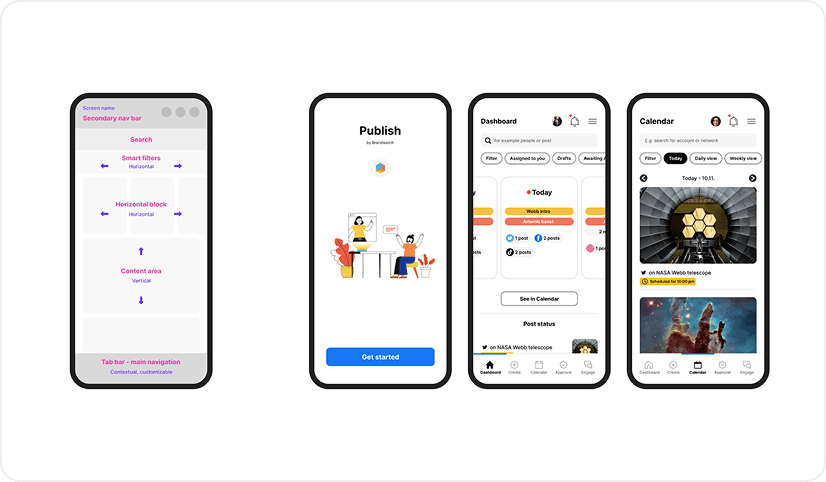
Main navigation concept
The Process
From diagnosis to validated vision
Phase 1: Diagnosis — Design audit across all three apps. The team helped rating issues by severity against our design principles. Average score: 2.6 out of 5 😩
Phase 2:Customer Research — 9 interviews with power users who'd pushed through the friction. Focused on jobs-to-be-done, not just complaints.
Phase 3:Vision & Validation — Designed a consolidated app concept with bottom tab navigation, three-step publishing flow mirroring desktop, unified content calendar, and minimal black-and-white UI letting content stand out.
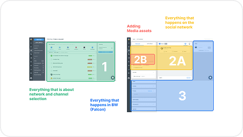
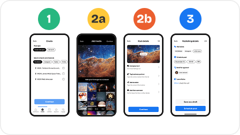
Desktop and mobile publishing flow alignment
The Outcome
Groundwork laid, now being built upon
The vision was validated and ready for development. Leadership had signed off, the prototype had passed critique, and we had a prioritized roadmap.
Then priorities shifted. A major acquisition created new integration demands, and R&D resources were reallocated. Mobile was put on hold—but not abandoned.
What survived: The research became the definitive internal reference for mobile customer needs. The design audit established quality standards across other surfaces. The personas, validated flows, and design patterns didn't gather dust—I've since learned the team is actively reusing the designs, insights, and learnings from this work in their current mobile renewal initiative. The groundwork meant they could restart without starting from scratch.
Read another case study
Wuff: Building a community app from zero
Raised €87K, acquired 3K users, scaled team to 20+.
GAN + Spaghetti: From prompt friction to production workflow
Built a prompt tool in a sprint. Now shipping production designs through it.